Live briefing

Everything about Display typeface
Face designed for use at large sizes
A display typeface is a typeface that is intended for use in display type at large sizes for titles, headlines, pull quotes, and other eye-catching elements, rather than for extended passages of body text. Wikipedia →
🧭 Start here: a 6-step reading path
- Read the overview: Display typefaceA 5-minute orientation
- Pick up a classic book: Computers and TypesettingThe most-reprinted book on the subject
- Read the landmark paper: Utilising psychophysical techniques to investigate the effects of age, typeface design, size and display polarity on glance legibilityCited 39 times
- Go sideways: Sans-serifA closely related topic
- Go sideways: Slab serifA closely related topic
📖 Definitions
No dictionary entry for this exact phrase.
🗂️ The subject at a glance
🏆 Landmark papers (most cited)
Utilising psychophysical techniques to investigate the effects of age, typeface design, size and display polarity on glance legibility
Impact of Typeface and Colour Combinations on LCD Display Legibility
PERANCANGAN HURUF DISPLAY TYPEFACE DENGAN BERBASIS AKSARA LONTARA
PERANCANGAN TYPEFACE BALINIKI SEBAGAI FONT DISPLAY BERKARAKTERISTIK BALI
The Role of Arabic Display Font Design in Enhancing Digital Visual Communication: An Applied Study on Wassat Typeface
A Study on the Development of Hangeul for Display Typeface -Focused on the development of the digital font “Flower Binyeo”-
📚 Books worth reading
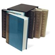 Computers and TypesettingDonald Knuth · 1986
- 📕BA MPD Design History thesis 1990London College of Printing. · 1990
- 📕[ Type specimens]Cloister Press. · 1921
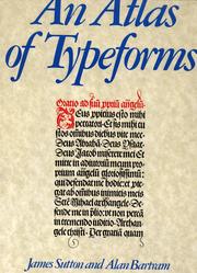 An atlas of typeformsSutton, James · 1968
 Digital typeface libraryHarvey Karp · 1985
- 📕A book of typefacesW.S. Cowell Ltd. · 1952
- 📕TypeGates, David · 1973
- 📕The typography of newspaper advertisementsSir Francis Meynell · 1929
Ranked by number of editions on Open Library, a rough measure of how lasting a book is.
🔗 Related topics
- Sans-serif In typography and lettering, a sans-serif, sans serif (/ˈsæn(z) ˈsɛrɪf/), gothic, or simply sans letterform is one that does not have extending features…
- Slab serif In typography, a slab serif (also called mechanistic, square serif, antique or Egyptian) typeface is a type of serif typeface characterized by thick, block-like…
- Reverse-contrast typefaces A reverse-contrast or reverse-stress letterform is a typeface or custom lettering where the stress is reversed from the norm, meaning that the horizontal…
- Fat face In typography, a fat face letterform is a serif typeface or piece of lettering in the Didone or modern style with an extremely bold design. Fat face typefaces…
- Didone (typography) Didone (/diˈdoʊni/) is a genre of serif typeface that emerged in the late 18th century and was the standard style of general-purpose printing during the…
- Caslon Egyptian Egyptian is a typeface created by the Caslon foundry of Salisbury Square, London around or probably slightly before 1816, that is the first general-purpose…
- Akzidenz-Grotesk Akzidenz-Grotesk is a sans-serif typeface family originally released by the Berthold Type Foundry of Berlin in 1898. The German Akzidenz (literally 'jobbing'…
- Clarendon (typeface) Clarendon is a slab serif typeface that was released in 1845 by Thorowgood and Co. (or Thorowgood and Besley) of London, a letter foundry often known as…